Explaining ML model results using Cumulative gains and lift instead of ROC curve are much more intuitive

July 24, 2022

The cumulative response curve (also known as cumulative gains in Data Science) and Lift curve are two different visuals that provide an effective mechanism to measure the accuracy of the predictive classification model.
They are generally preferred, when cost and benefits discussed in the Using an expected value for the designed Machine Learning solutions post are difficult to calculate, but the target variable/class mix has a probability of not changing (i.e. The class balance distributions are expected to be roughly the same), then the Cumulative response curve is helpful.
The cumulative response curve is further related to the ROC curve but the Cumulative response curve is more intuitive and makes it a preferred choice when communicating and showing results to business stakeholders who may not have a sound understanding of the technical nuances of the ROC curve. And the lifts are further calculated based on the cumulative responses.
The Cumulative response displays the results in terms of benefits that one can achieve using the developed predictive model. And the lift curve plot the hit rate, which is the percentage of positively correctly classified (y-axis) w.r.t. the percentage of the target population (x-axis).
The curve metrics further help in making business decisions. Consider a scenario where the company needs to run an advertising campaign and there is a cost associated to target each customer. Therefore the company needs to build a machine learning model and get the right customers which can maximize profitability. The company has a dataset of 10,000 customers available to test. Out of which 500 customers have responded positively to the advertising campaign.
We will take the above-described scenario of an advertising campaign throughout the post to understand the Cumulative response and lift curves.
Decile Groups
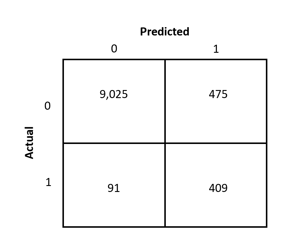
Decile groups are the core behind the generation of the Cumulative response curve. Let's assume we already have a model which can predict the customers that the algorithm thinks are highly profitable. We have also tested the results with historical data and created confusion metrics that can give details about the results where:
- The algorithm has predicted 409 customers to be profitable and the customer turns out to be profitable.
- The algorithm has predicted 91 customers to be NOT profitable and the customer turns out to be profitable.
Refer to the confusion matrix shown below:
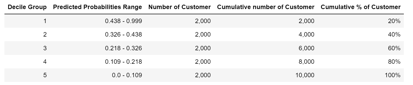
The algorithm has given the probability of each customer being profitable. The first step is to sort the customers by the probability in decreasing order. i.e. highest probability will be first and the lowest probability will be at the end.
After sorting the probabilities the next step is to create equal size decile groups. For e.g. If we create 5 decile groups then in each group there will be 20% of customers. Further first decile group will have the customers where the predicted probability will be highest and so on. The summary of the created decile group created on the dataset is represented below:
From our historical data, we further know that the positive response rate of 5%. Our advertising campaign dataset has 10,000 customers out of which 500 customers have responded. Suppose we target 2,000 customers therefore assuming a 5% success rate as per historical data, we will expect to see 100 customers responding.
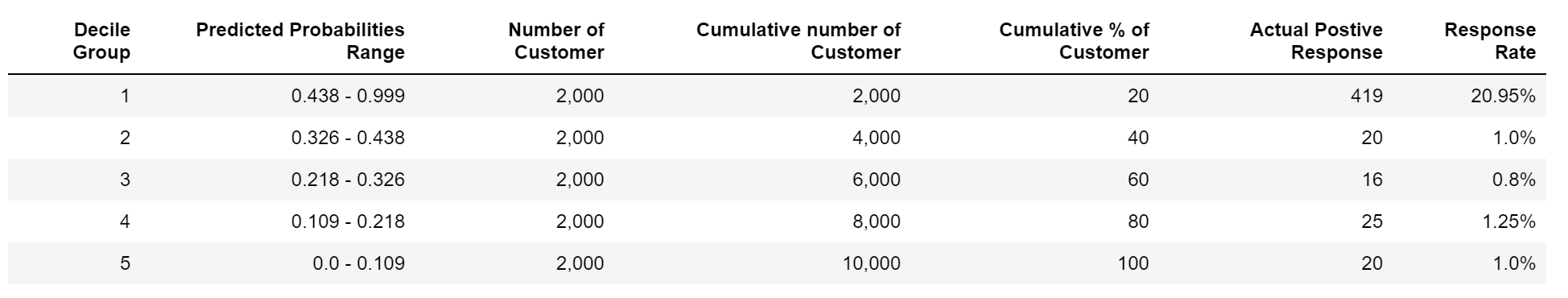
But if we look at the response rate based on the first decile group the positive response rate (of 20%) is approx. 15% higher than the rate that we can expect to see. We can further see in the graph shown below that the response rate from the first three decile groups is higher than the average response rate.

Cumulative Gains
From the decile groups, we can easily calculate the cumulative gains. We can calculate the cumulative gain by taking the responders in a decile group and dividing it by the total number of responders as shown in the table below.
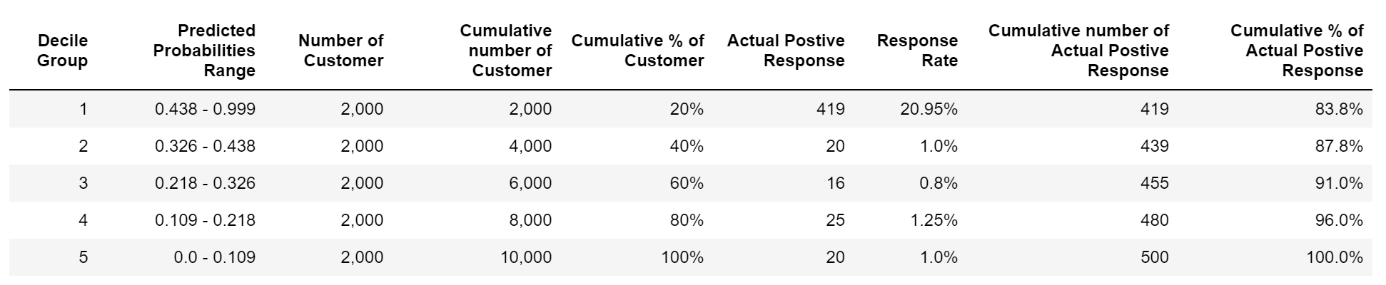
For example, In our advertising campaign dataset, 419 responders are there in the first decile group, and in total there are 500 responders, therefore cumulative gain from the first decile group will be 419/500 = 83.8%, and so on. In this way, we can have a cumulative gain curve as shown in the diagram below:

The dashed lines represent no gain which represents the results that we will achieve by contacting customers at random. The closer the cumulative gains line is to the top-left corner of the chart, the greater the gain; the higher the proportion of the responders that are reached for the lower proportion of customers contacted.
We can use the cumulative gain graph to select the customers and expect to achieve a higher probability of success based on a given marketing budget. The point that we decide from the graph which satisfies the marketing budget and gives better gains is called the tipping point.
With this, we have our first curve of cumulative gain created which can be used to decide the customer base and maximize profitability. Next, let's move forward and define the lift curve.
Lift Curve
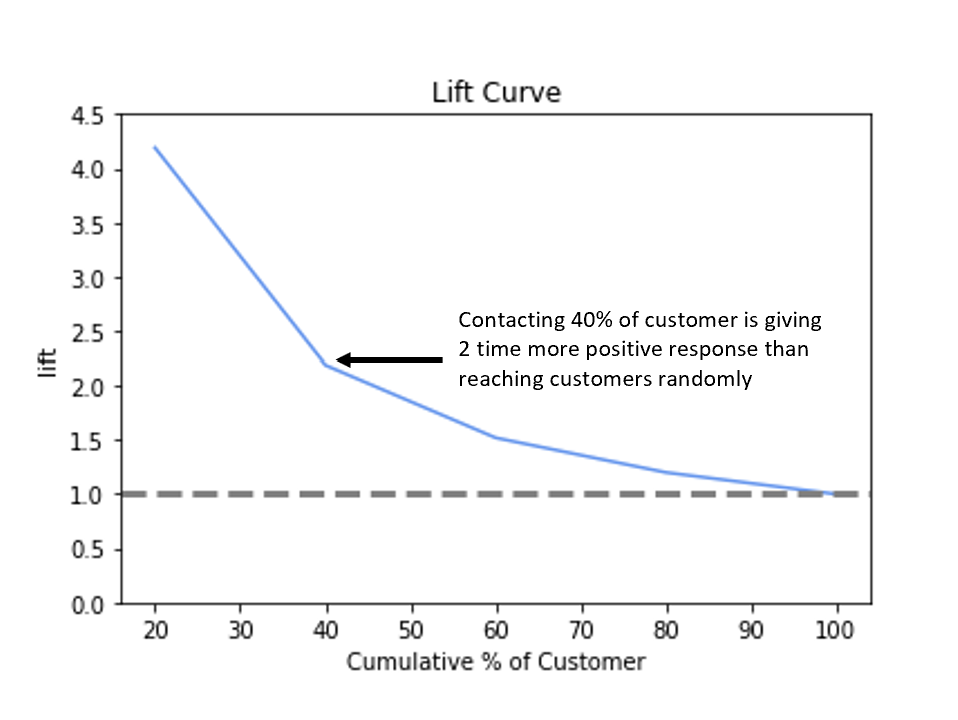
To complete the analysis, we will be calculating the lift of the trained machine learning model on the advertising campaign dataset. The lift is simply the ratio of the percentage of responders reached to the percentage of customers contacted. Refer to the table shown below:
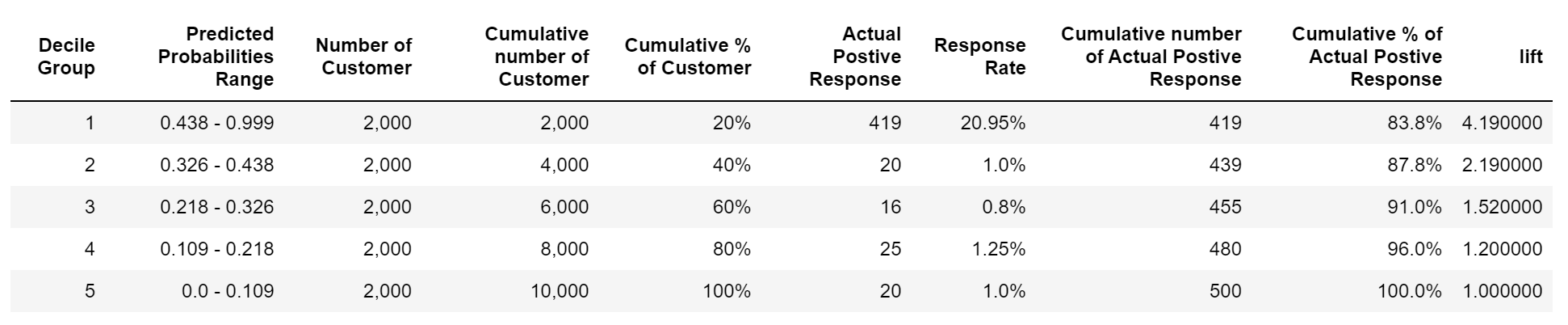
Therefore, the lift of 1 will means that there is no gain as compared to contacting customers at random. Our focus is to have a lift greater than 1 and the higher the better. If we see our first decile group we are getting the lift of 4.19, which means that we will be reaching 4.19 times more number of the responders as compared to reaching them at random and so on. The figure shown below displays the lift curve of the above-created deciles.
Summary
The Cumulative response curve is helpful and gives intuitive results for the problem statement that we have defined of targeting customers to maximize the gains. In a similar way, the Cumulative response curve can be used for other related problems as well. A few examples include deciding on the retention scheme to avoid churns, deciding on the credit card offer and reducing payment defaults, etc.
Author Info