Explained interpretation of ROC Curve with an help of example

June 19, 2022

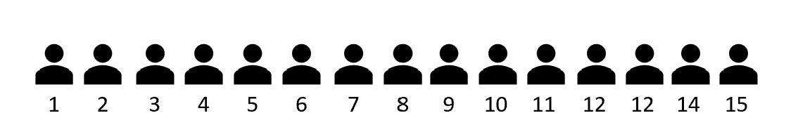
Consider a scenario where we have trained the classification machine learning model to identify that given 15 users will read this post or not using a trained logistic regression algorithm. The probability of each user is identified using the trained machine learning model and we want to evaluate the accuracy of the machine learning model before deploying it to the production environment.
A few ways to evaluate the machine learning model are to check the accuracy, confusion metrics, precision, recall, f1 score, etc. Along with the above state evaluation mechanism, there is one more popularly used technique called as ROC Curve (Receiver Operating Characteristic curve) which is widely used in the industry.
ROC Curve is one of the popularly used methods to measure the accuracy of the classification machine learning model and can be customized to use for regression problems as well. In this post, we will understand how the intuition behind the ROC curve and what is AUC ROC.
Let's get started.
What is the need for the ROC curve?
Before we get into the details of the ROC curve explanation. Let's understand thresholding as it will help later in the post to understand the ROC curve and ultimately AUC ROC.
Let us go to our scenario defined where we want to classify whether users will read this post or not. We have trained a logistic regression model which returns results in form of probability. (i.e. The algorithm will return the probability for each user) Higher the probability returned by the algorithm, the higher the chances that the user will read this post and vice versa. Refer to the diagram shown below stating the probabilities that the algorithm has provided.
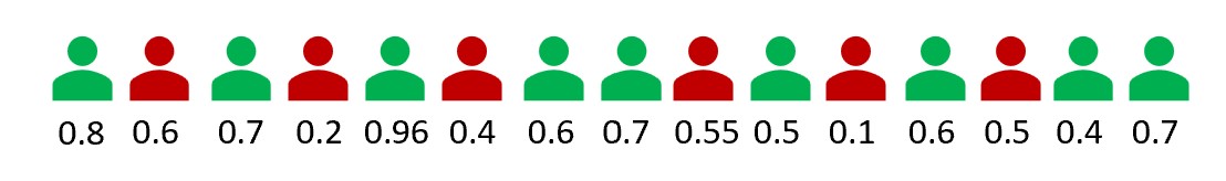
The green and the red color users represent the ground truth of user has read the post or not respectively.
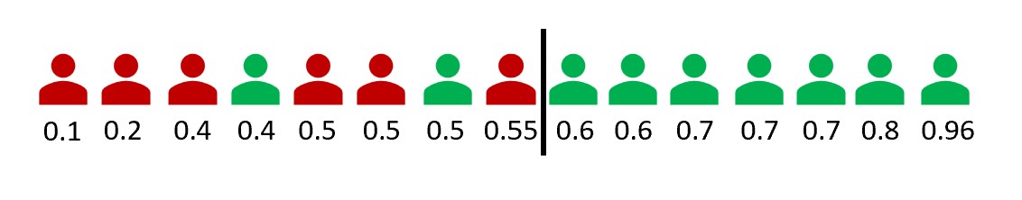
Since the model returns the results in terms of probability, therefore we can define the threshold on which we want to classify the results. By default, most algorithms consider a threshold of 0.5 but in order to achieve higher accuracy, we want to tune the threshold. Refer to the diagram shown below showing the accuracy at the 0.5 thresholds.
With a 0.5 threshold, two users who will read the post and one user who will not read the post are misclassified.
The question next is how do we tune the threshold? How to come up with the threshold that can give us higher accuracy? This is exactly where ROC curves come to the rescue and help us in figuring out a threshold that can give high accuracy or comparatively better accuracy than the default 0.5 thresholds.
What is the ROC curve?
ROC is a curve between the True Positive Rate (TPR) and False Positive Rate (FPR) where TPR is defined as a proportion of observations that are correctly predicted as positive and FPR is defined as a proportion of observations that are incorrectly predicted as positive.
Formula for calculating TPR and FPR is as stated below:
$$TPR = {{True Positive} \over {True Positive + False Negative}}$$
$$FPR = {{False Positive} \over {True Positive + False Negative}}$$
NOTE: The above stated formula of TPR and FPR are derived from the confusion matrix.
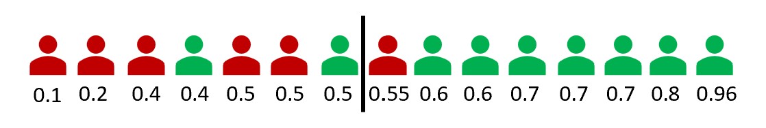
For the different thresholds, we will get different TPR and FPR. Therefore ROC curve is a curve for all possible thresholds. Refer to the ROC curve of the example of the classification model to determine whether the user will read this post or not.
import pandas as pd
import matplotlib.pyplot as plt
from sklearn import metrics

df = pd.DataFrame(
    {
        'users': [1, 2, 3, 4, 5, 6, 7, 8, 9, 10, 11, 12, 13, 14, 15],
        'probabilities': [0.1, 0.2, 0.4, 0.4, 0.5, 0.5, 0.5, 0.55, 0.6, 0.6, 0.7, 0.7, 0.7, 0.8, 0.96],
        'class': [0, 0, 0, 1, 0, 0, 1, 0, 1, 1, 1, 1, 1, 1, 1]
    }
)

fpr, tpr, _ = metrics.roc_curve(df['class'],  df['probabilities'])

plt.plot(fpr,tpr)
plt.ylabel('True Positive Rate')
plt.xlabel('False Positive Rate')
plt.title('ROC Curve')
plt.show()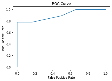
We can conclude from the graph that the 0.55 threshold will give better results than the 0.5 default threshold.
As compared to earlier at the 0.5 thresholds, this time only two users who will read the post are misclassified.
So far we have got an understanding that ROC curves help to figure out the thresholds that can give better accuracy than the default 0.5 thresholds. But what is AUC ROC?
AUC ROC
AUC stands for Area Under the Curve and it calculates the area under the ROC curve. Ideally, the goal is to maximize the area under the ROC curve where TPR is maximized and FPR is minimized.
Let's calculate the area under the curve as shown above in our example ROC curve.
auc = metrics.roc_auc_score(df['class'],  df['probabilities'])
print(auc)

# Output
0.89
I am going to leave you with an open statement. If the AUC of the ROC curve is 0.5 the machine learning model is completely random and has not learned anything. Do you think this statement is true? Can you justify the statement?
Author Info